
Product · Learning · UX/UI
Mandarin for real life. Built around speaking, tones and repetition.
A self-initiated mobile learning concept for Mandarin focused on tones, useful conversation and short daily practice — designed from product structure through practice modes.
Read the story
- Role
- Product strategy UX/UI design
- Timeline
- 2026
- Scope
- 16 screens · Design system · Learning flows
- Tools
- Figma · Prototyping Mobile product design
01 — The Problem
The gap I wanted to explore: language apps can teach content without making speaking feel natural.
Every major Mandarin app has a version of this problem. Vocabulary grows. Tones stay abstract. Conversation arrives too late.
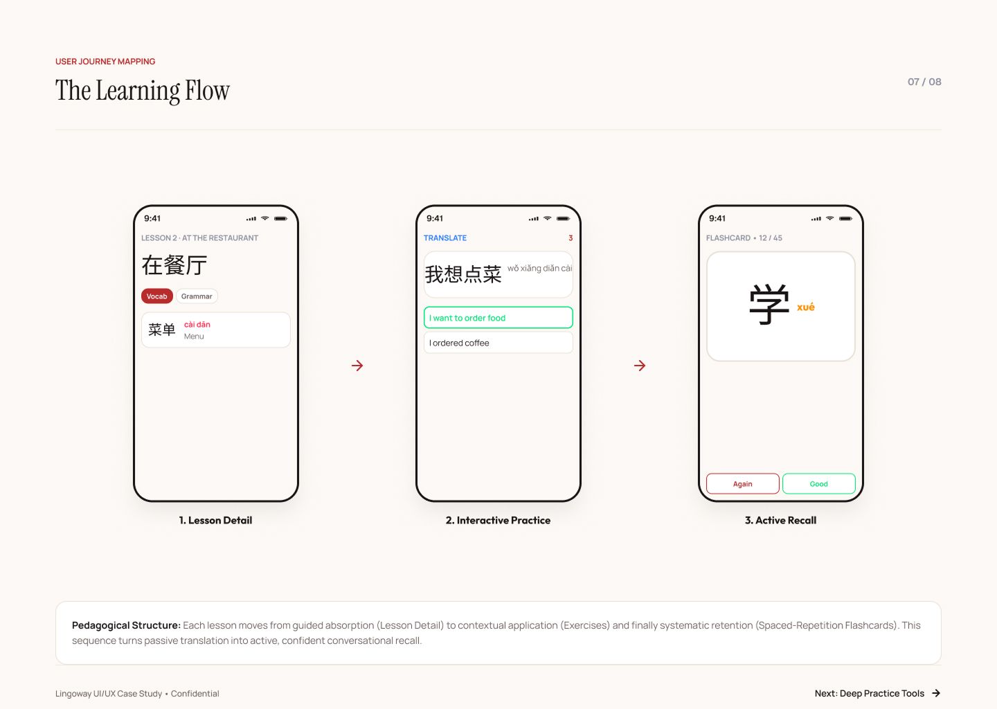
Tone drills often sit apart from vocabulary, so learners recognise words but still struggle to say them naturally.
Pronunciation · Tone systemI wanted short daily sessions to feel lighter than long, translation-heavy lesson trees.
UX · Session designUseful phrases are often buried behind levels instead of appearing early in realistic situations.
Progression · Content structureCommuters need lessons, flashcards and audio even when connectivity is unreliable.
Infrastructure · Offline-first02 — The Insight
Core thesisTone, context and repetition should live in the same loop.
The system treats pronunciation as part of every word, puts practical conversation close to the surface and keeps core practice available offline.
“Teach the language you’ll actually speak, not the language you’ll only read.”
03 — The Work
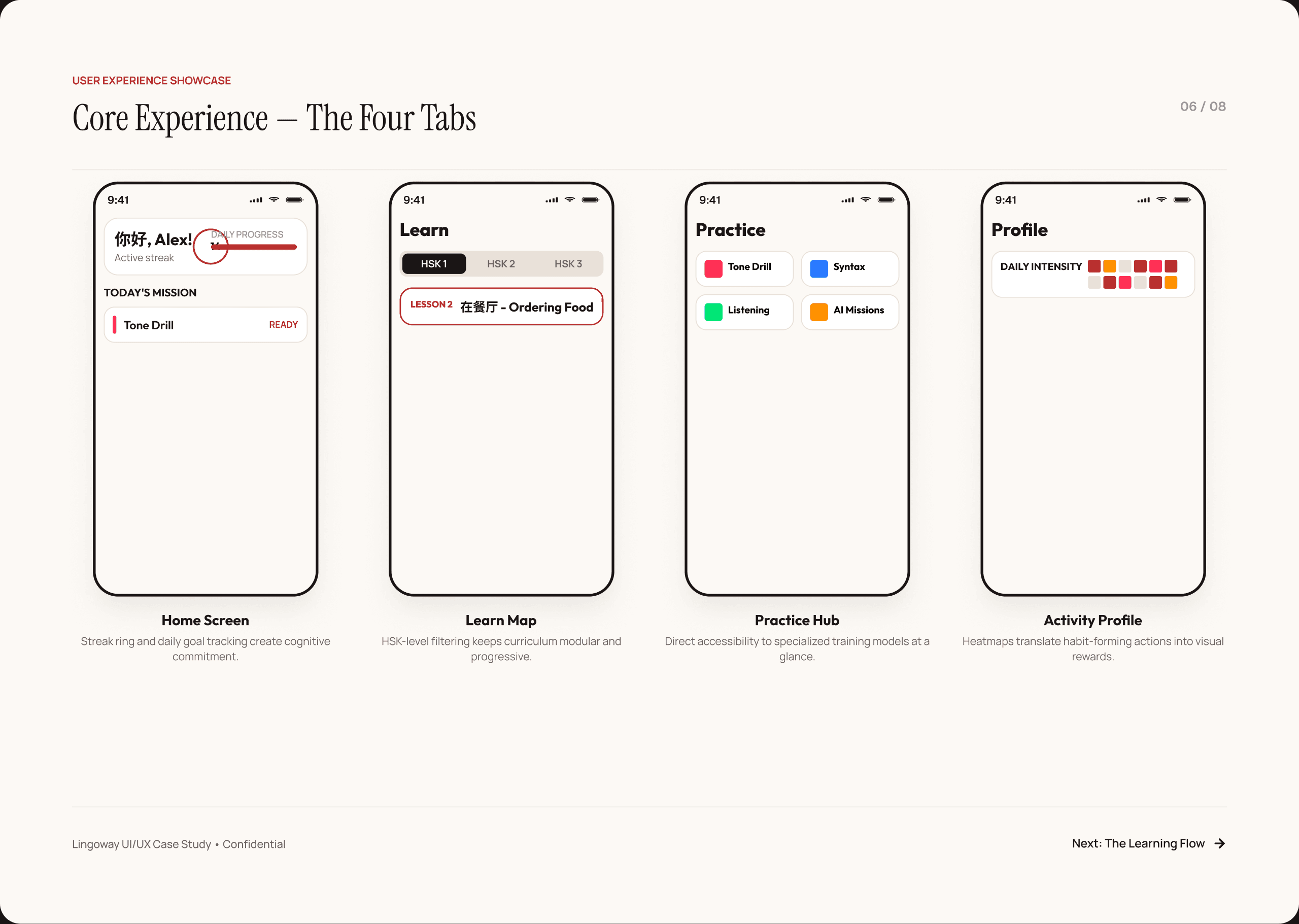
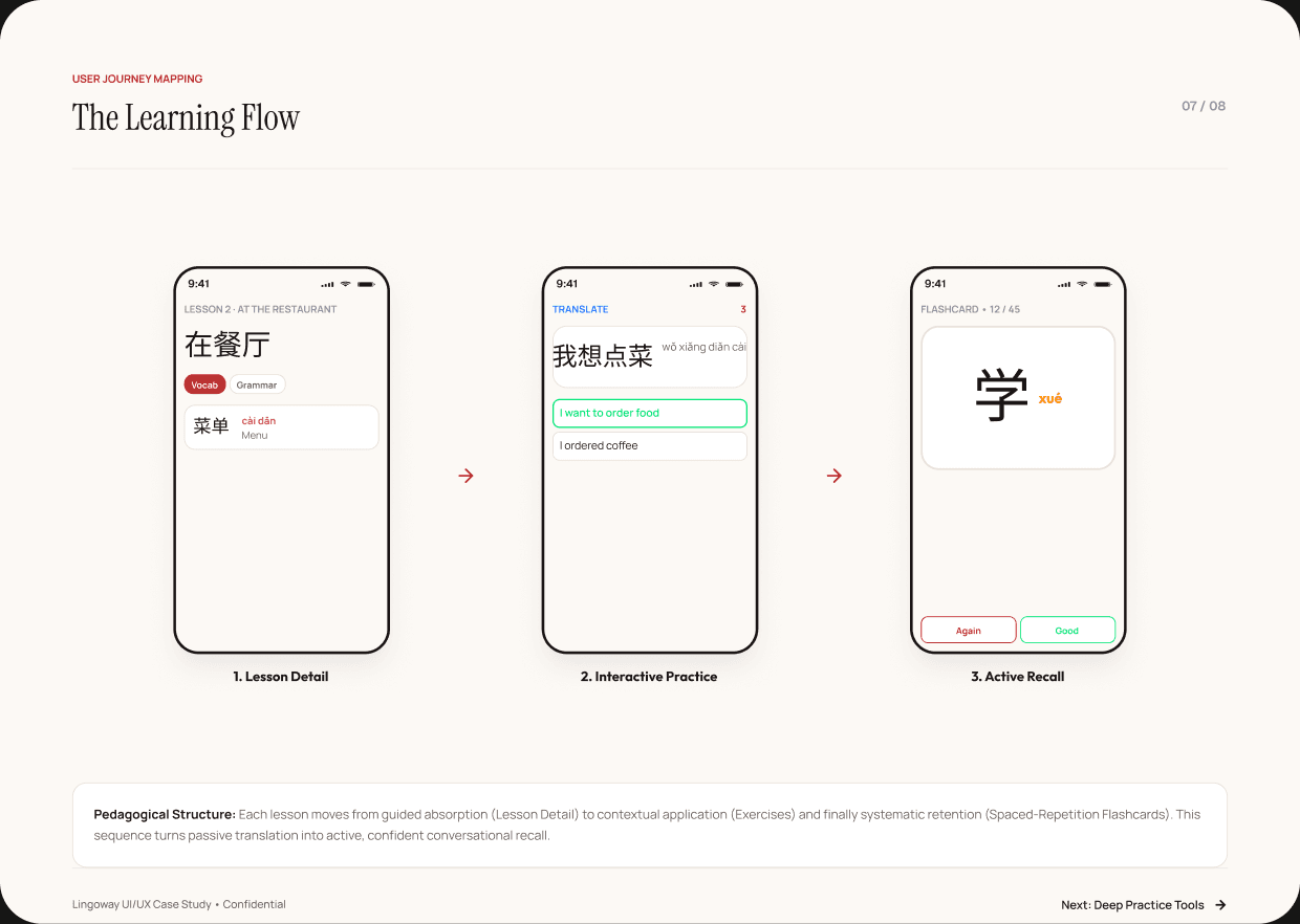
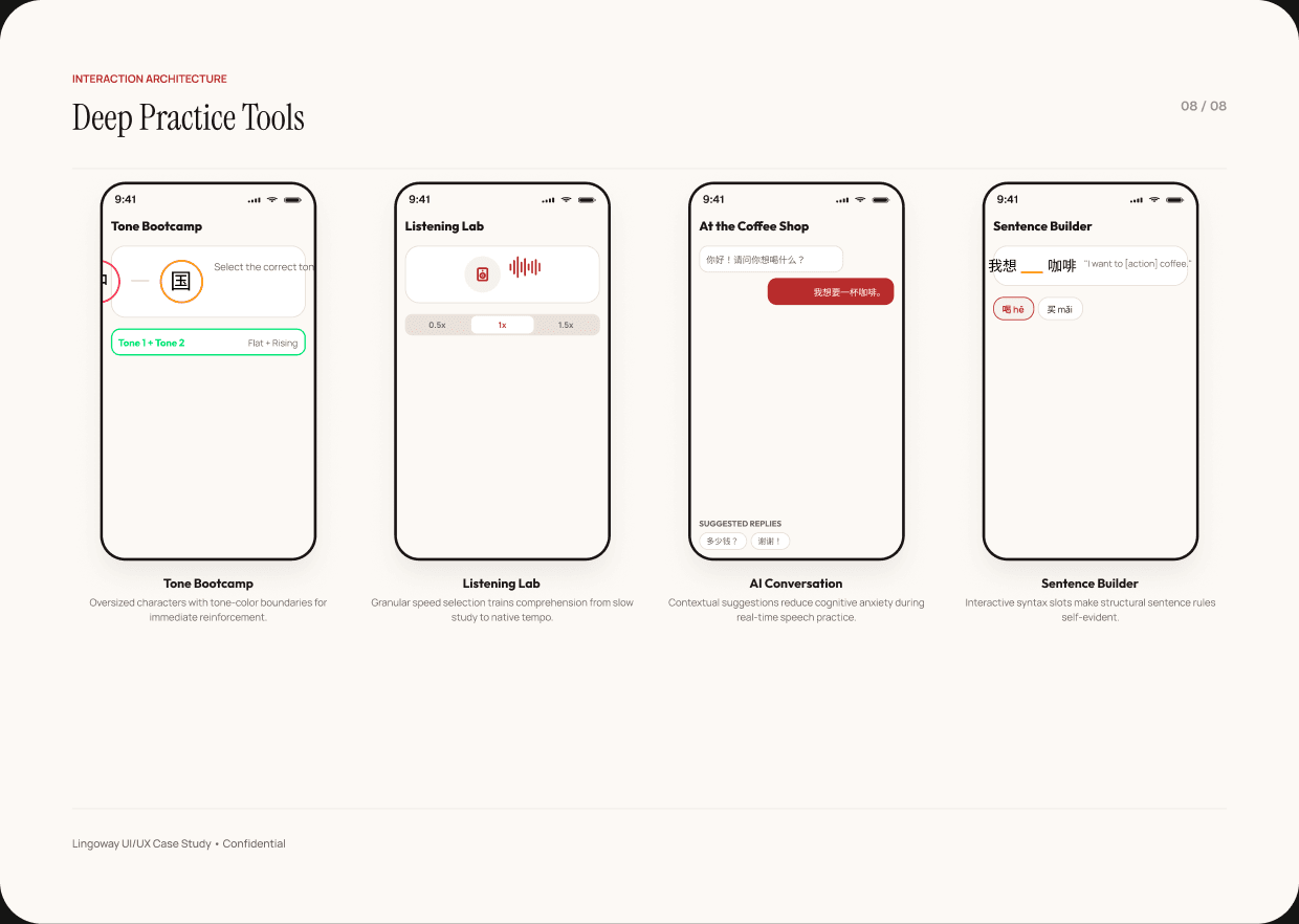
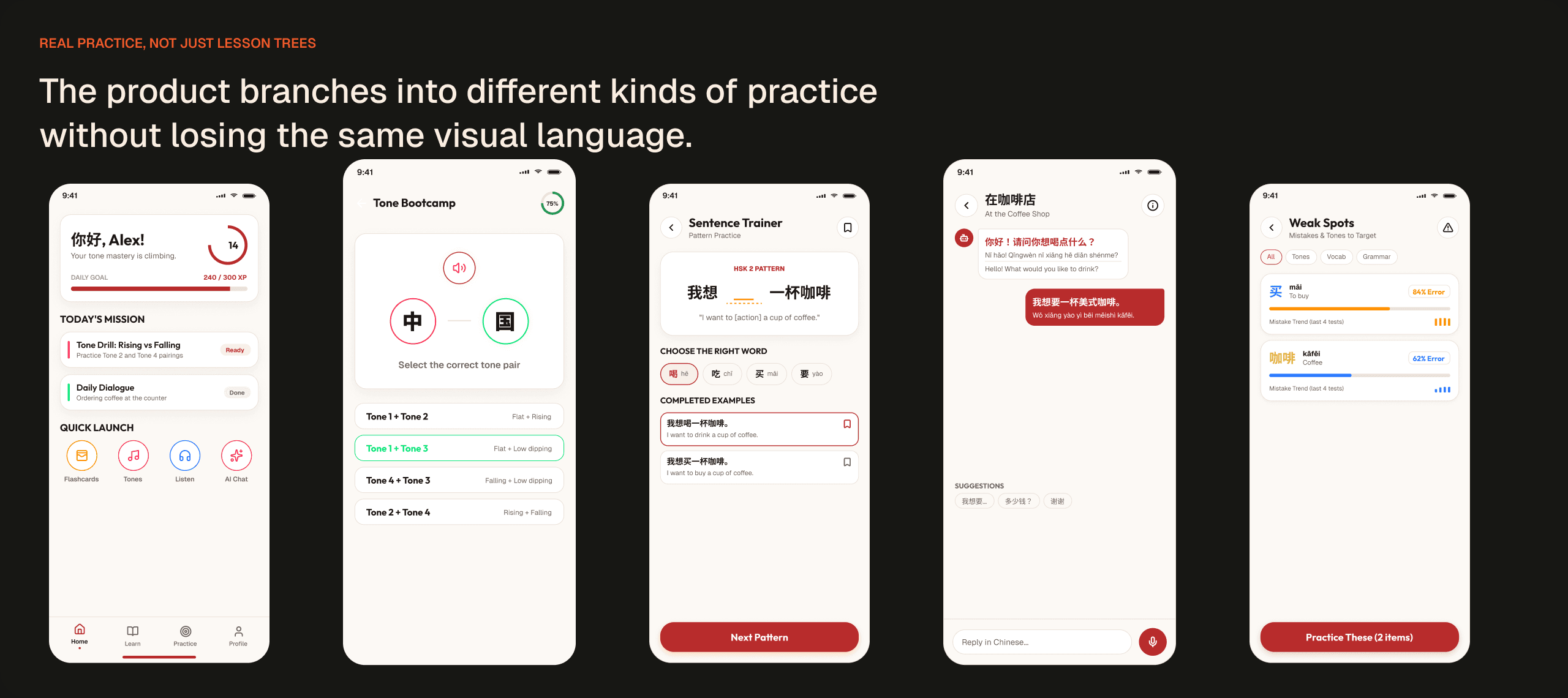
One learning system, sixteen connected screens.
Every screen is designed around one idea: reduce friction so learners can focus entirely on the language.
04 — Key Decisions
The calls that shaped it.
Four structural decisions that define the product’s teaching model.
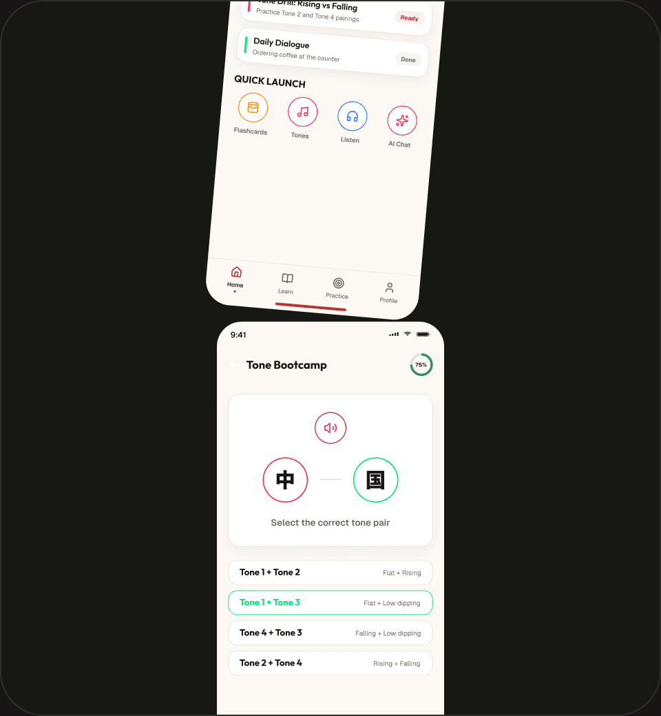
Pinyin uses the same tone colours across vocabulary, flashcards and exercises so pronunciation stays visible in context.
A shallow navigation model keeps the daily hub, HSK path and deep practice tools easy to return to.
Lessons, flashcards and exercises are designed to work without a connection; AI conversation is the exception.
Exercises start with phrases learners can actually say, then reveal structure through repetition and sentence building.
05 — Reflection
Designing for Mandarin made language itself part of the interface.
The interface works best when the teaching disappears into the interaction. Every tone colour, every session length and every navigation shortcut is a deliberate product decision, not decoration.
Concept scope: 16 unique screens · 10 exercise types · 4 HSK levels mapped.
Explore the playgroundNext case study →
03 Jade DynastyHeritage, without the pastiche.View case study