
Brand · E-commerce · Visual system
Heritage, without the pastiche.
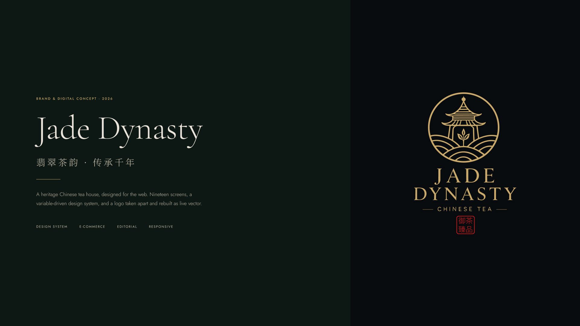
A self-initiated identity and e-commerce concept for a fictional Chinese tea house — nineteen screens, a reusable design system and a brand built to feel refined without leaning on visual clichés.
Read the story

- Role
- Brand & digital designer
- Type
- Self-initiated concept
- Scope
- Identity · 19 screens Design system
- Year
- 2026
01 — The Brief
Premium tea online often falls into costume or generic wellness.
Dragons, brush strokes, and jade textures until the brand reads as fancy dress — or strip everything cultural out and it becomes one more minimal wellness shop. The brief was to find the third path.
“Treat tea as agriculture first, luxury second — altitude, picking windows, wok temperature.”
Dragons, brush strokes and jade textures until the brand reads as fancy dress.
Strip everything Chinese out and it becomes one more minimal wellness shop.
Treat tea as agriculture first, luxury second — altitude, picking windows, wok temperature.
A full commerce flow, an editorial section that earns authority, and a system a developer can build from.
02 — The rule that shaped everything
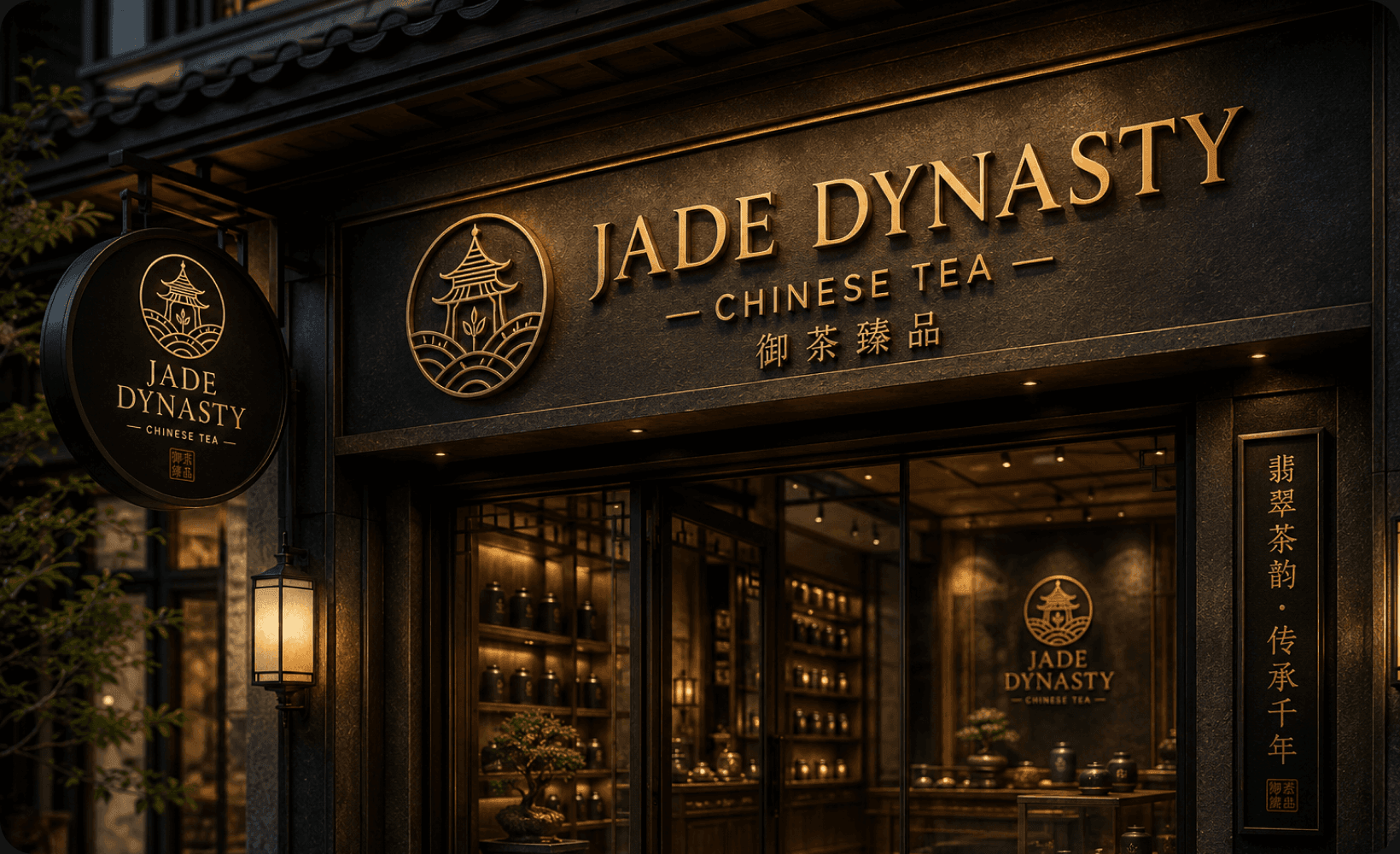
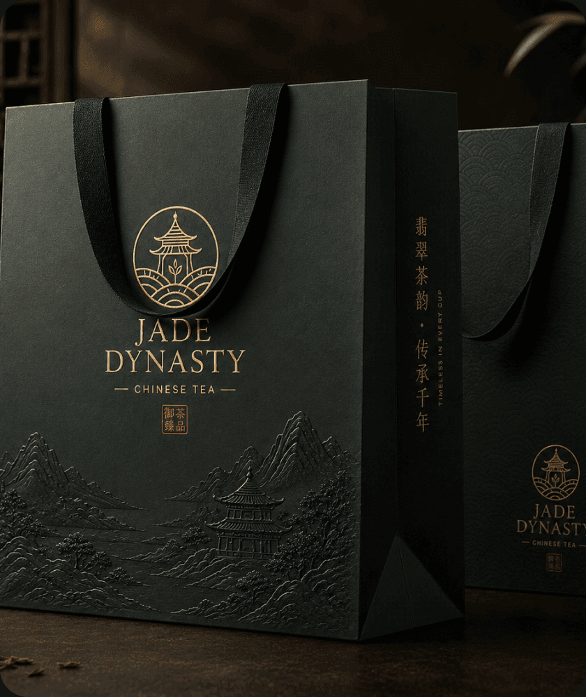
No overlays. No gradients. Let the materials do the work.
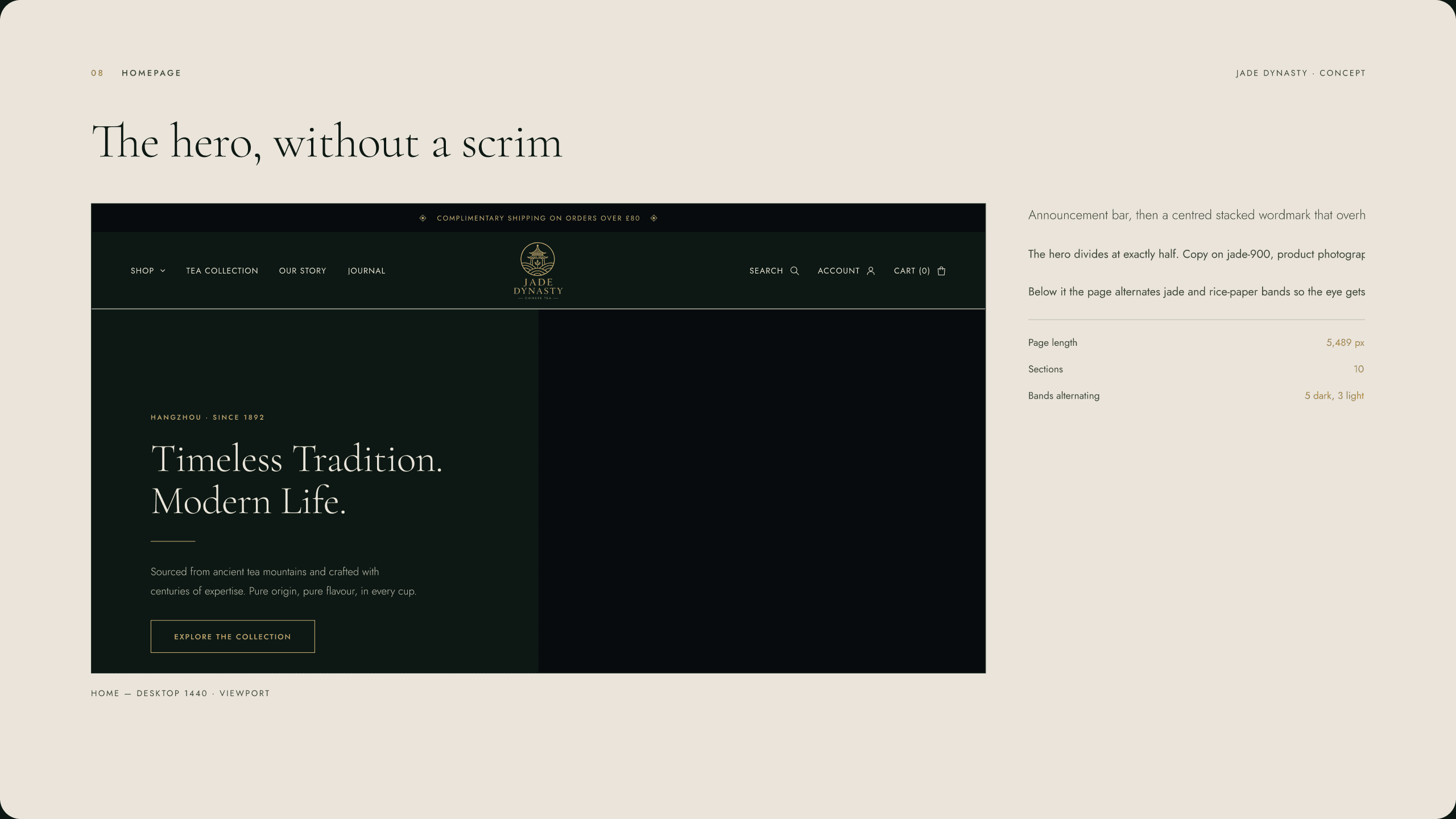
The hardest of three rules, and the most useful: without the easy tool for putting text on images, every hero became a deliberate hard split.
03 — The Work
Nineteen screens, one standard.
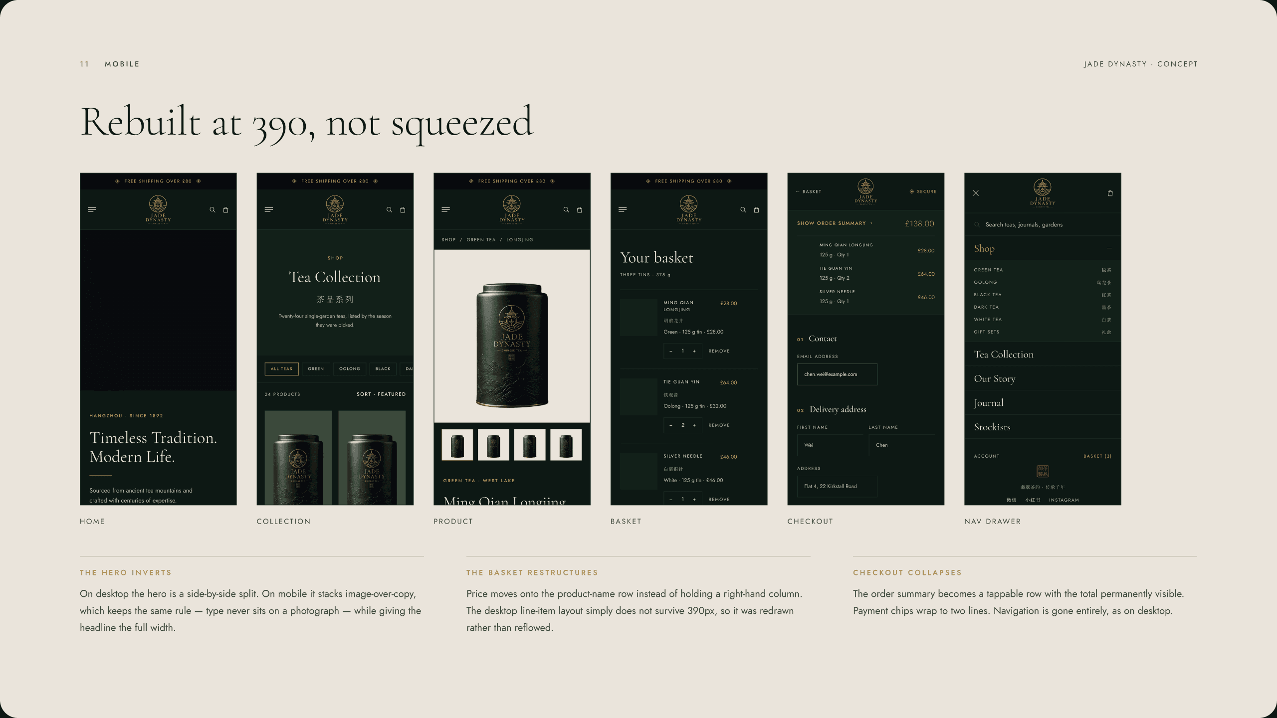
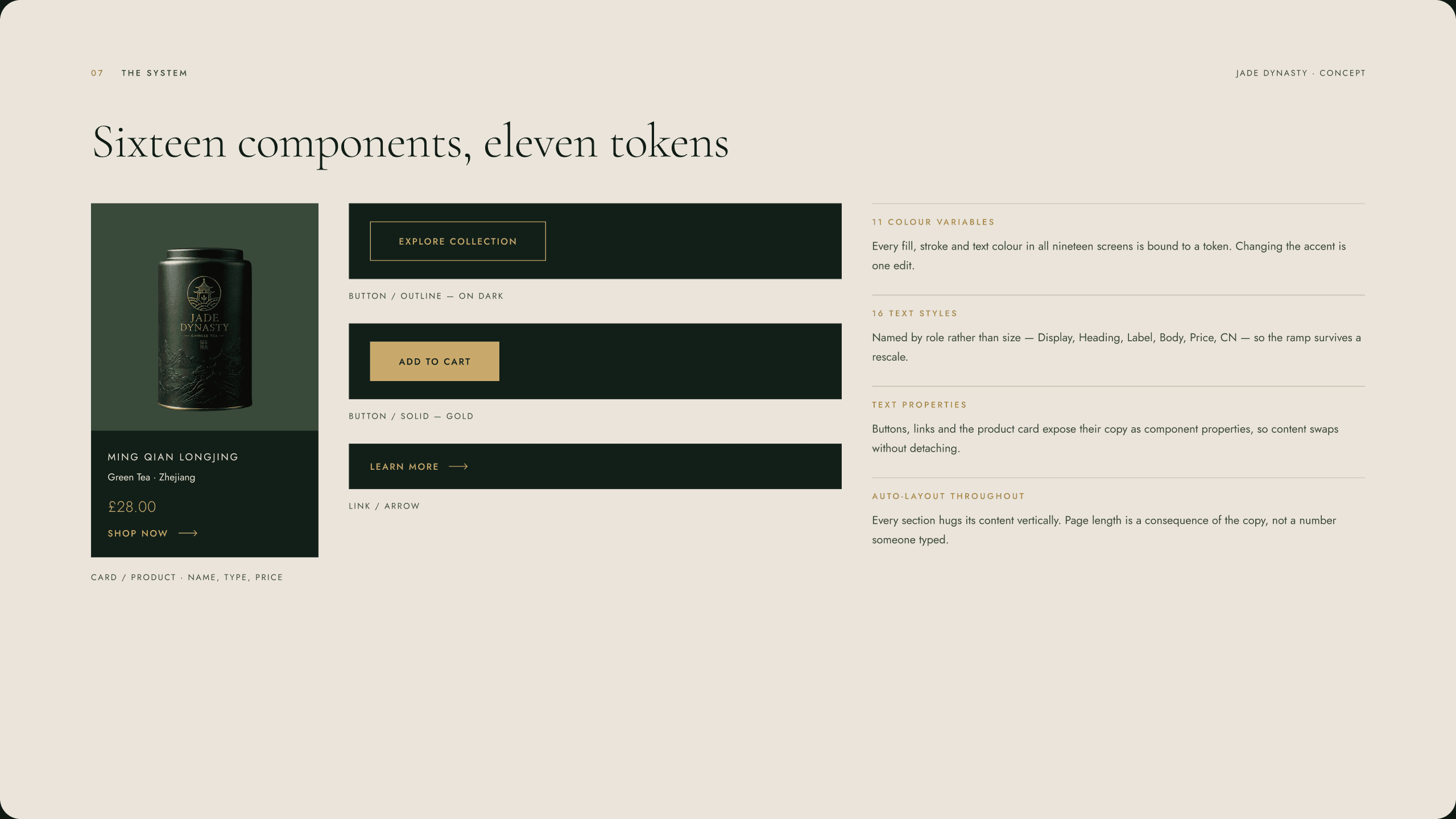
A complete e-commerce system — homepage through checkout — built on eleven design tokens and zero compromises on the rule.
04 — Key decisions
The calls that shaped it.
Three hard rules applied consistently from the first artboard to the last. When a rule broke, the page broke — and you could see it immediately.
Gold appears as a hairline, a rule or a price. Jade and charcoal carry roughly eighty percent of every page.
Used only on the seal, so it reads as ceremonial punctuation rather than an alert colour.
Chinese product names beside English and scroll-like vertical rhythm carry the heritage — not ornament.
05 — Type System
Chosen for its editorial authority and Renaissance roots. In this self-initiated concept, that sense of refinement supported the fictional heritage positioning without pretending the brand had a real historical lineage.
Clean, contemporary, and technically precise. The sans balances the serif and signals a modern commerce system rather than a museum piece.
06 — Reflection
The constraints gave the brand its character.
Three rules held from the first screen to the last made the system feel inevitable. No overlay meant every layout had to be honest about what the image was doing. No gradient meant every colour choice was load-bearing. Gold as accent only meant that every use of it landed.
View all workNext case study →
04 KairovaA playable operating system for real life.