Personal identity
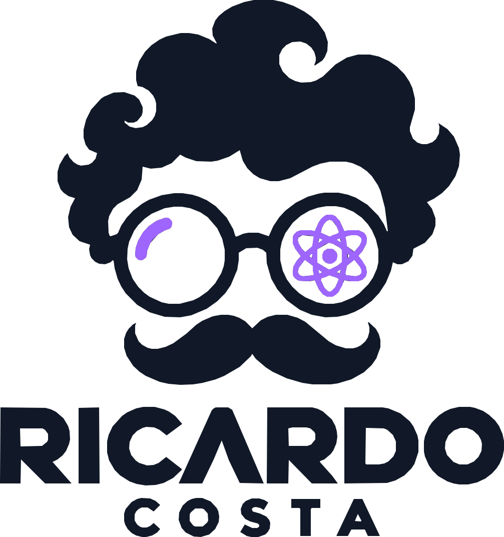
The logo is basically a stylised version of me.
The logo is a stylised version of me — the glasses, moustache, creative side, technical side and the purple I naturally use all the time.
Read the story
01 — The Brief
A personal mark built from the things that actually make me, me.
The hair reflects the creative side of who I am and the kind of work I’ve always been drawn to — illustration, animation, branding, visual design and just making things with personality. I didn’t want the logo to feel too corporate or generic, because that wouldn’t really feel like me.
“Creative, visual, technical, a little playful.”
The glasses are there because I actually wear them. They also gave me a natural way to represent the two sides of how I work: one visual and creative, the other more technical.
One side is about how something looks, feels and communicates. The other is about how it works. That is why one lens carries the technical symbol — a nod to UI/UX, front-end development, React and building real digital products.
02 — Construction
Simple enough to work everywhere.

03 — Scalability
Recognisable whether it is tiny, full-size or reversed.
On dark backgrounds the mark flips to warm paper with the violet lens kept as the accent.
04 — Brand Spec Sheet
Colour palette
Purple is there for a very simple reason: it’s my favourite colour. I’ve always naturally gravitated towards it, so when I was creating something that was supposed to represent me, using purple just made sense.
The technical symbol represents the part of my work that goes beyond visuals — UI/UX, front-end development, React and building actual digital products instead of stopping at the design stage.
05 — Brand Application
An identity built for the work I actually do.
06 — Reflection
One eye for how it looks. One eye for how it works.
Overall, the mark is just a compact version of how I work: visual, technical, a little playful, and interested in both the design and the thing behind it.
Explore the playground