
GRAPHIC DESIGN · BRAND SYSTEMS · MOTION
I build visual systems
that survive the real world.
Identity, packaging, social campaigns, retail graphics and motion — designed to stay coherent when the format changes.
IN-HOUSE · FREELANCE · COMMERCIAL PRODUCTION
DNA VAPES / DRAGON’S BLOOD
Identity · packaging · campaign system
THE WORK IS IN THE SYSTEM
One logo is easy. Keeping a brand recognisable
across thirty different assets is the actual job.
The strongest design work here came from production: adapting one visual language across labels, launches, social posts, print, retail and short-form motion without letting it fall apart.
01
Identity & packaging
The system has to hold together from logo to label to shelf.
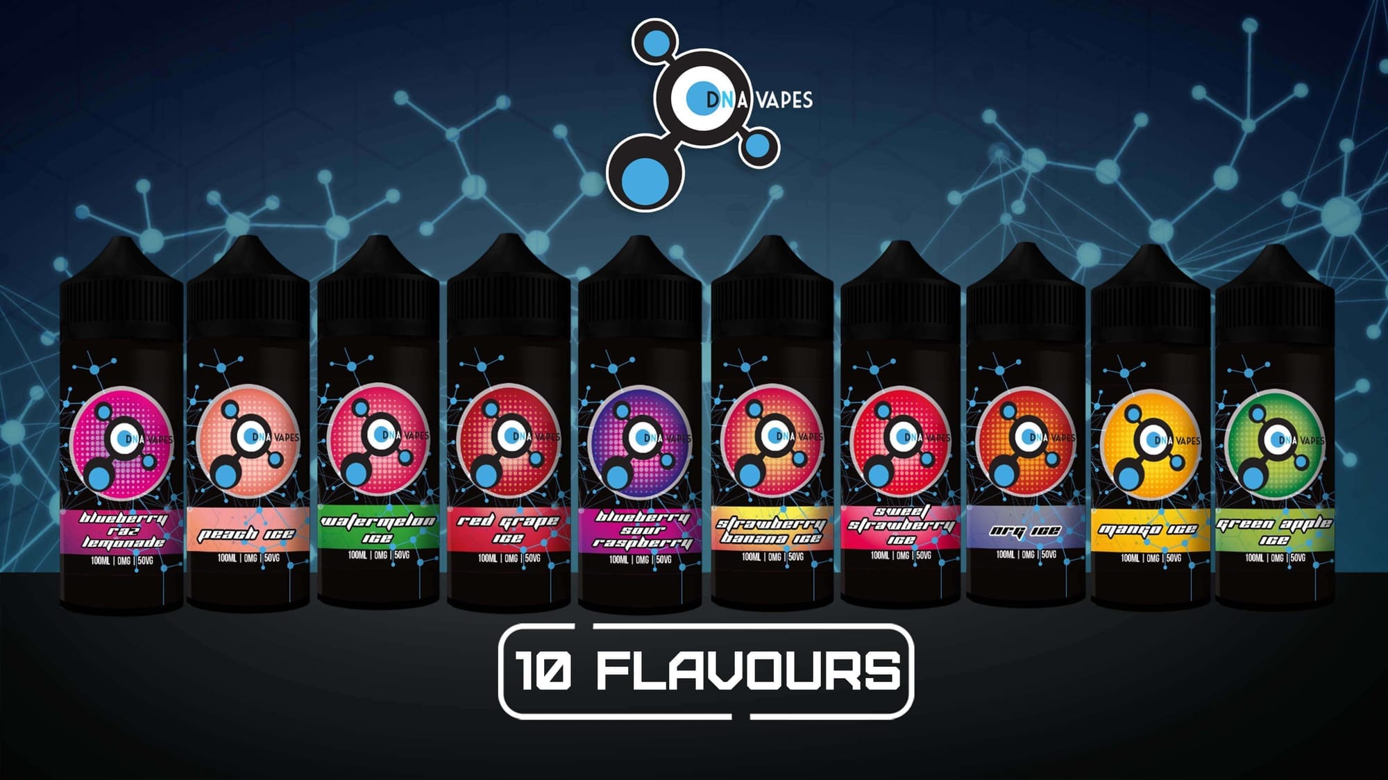
DNA VAPES
One identity. Ten flavours.
A modular product range designed to stay recognisable while every flavour carries its own colour and personality.
IDENTITY MARK
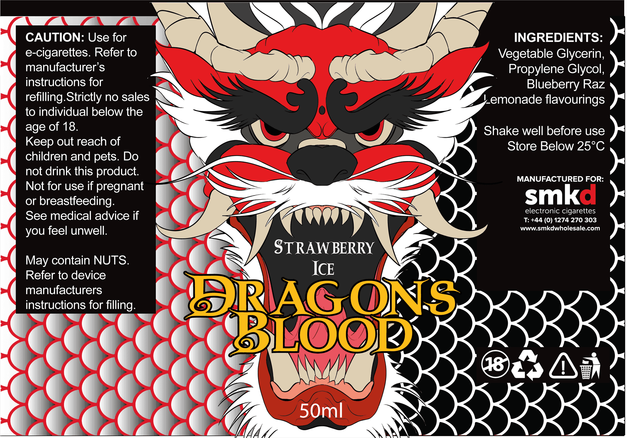
DRAGON’S BLOOD
Illustration built into packaging.
A louder label system where custom illustration does the brand work before the product name is even read.
02
Campaign & social
Same brand discipline, different product, audience and message.
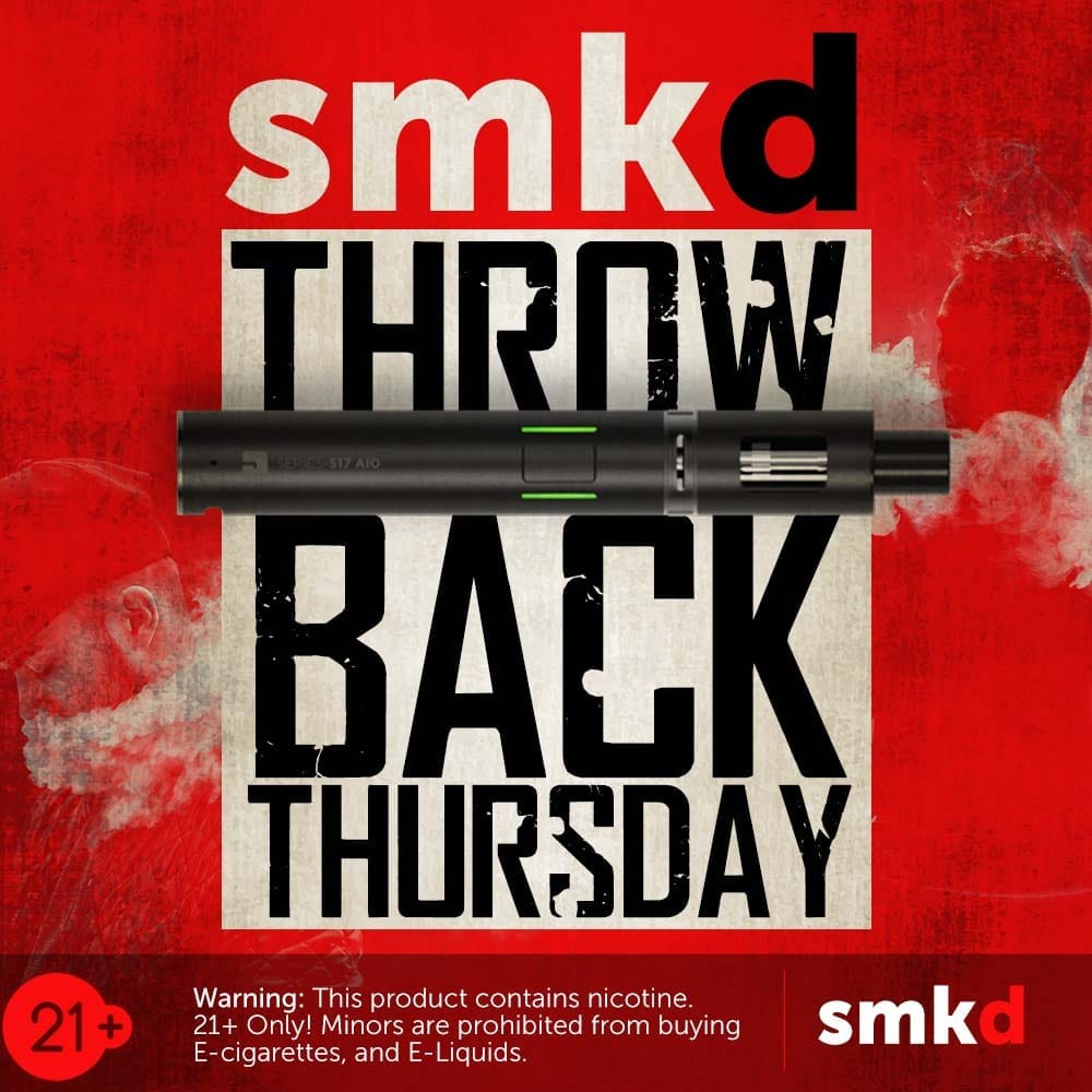
SMKD / SOCIAL CAMPAIGN
Throwback Thursday

SMKD / SOCIAL CAMPAIGN
Premium E-liquid
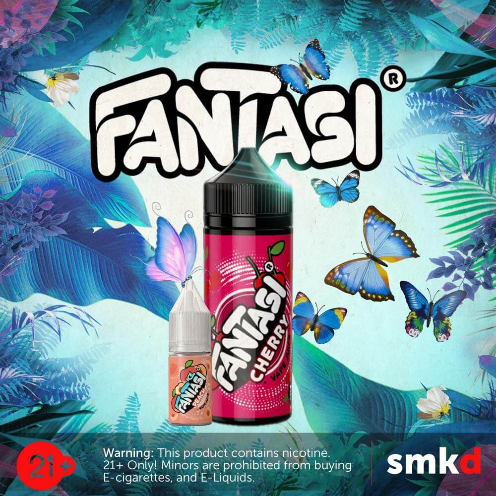
SMKD / SOCIAL CAMPAIGN
Fantasi
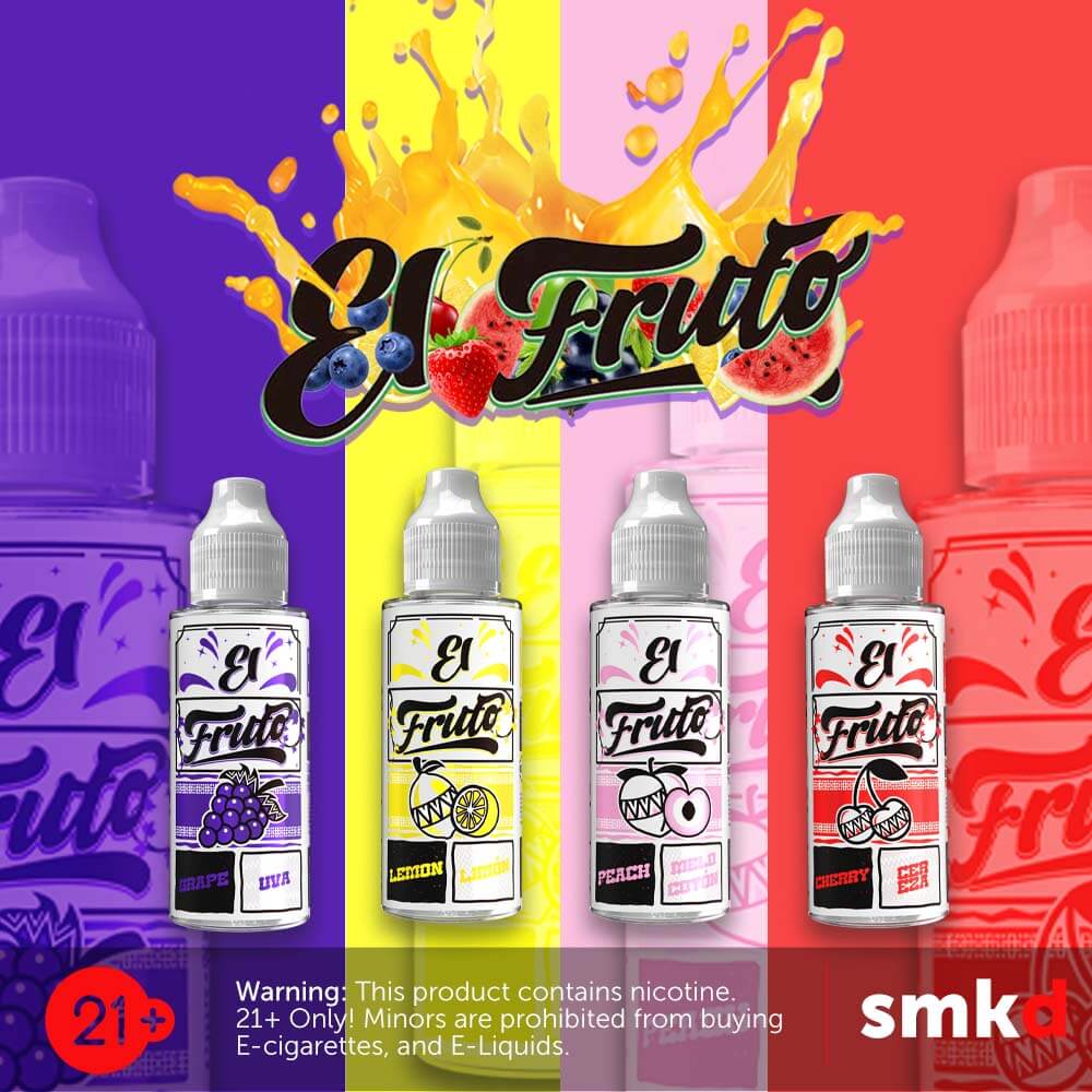
SMKD / SOCIAL CAMPAIGN
El Fruto
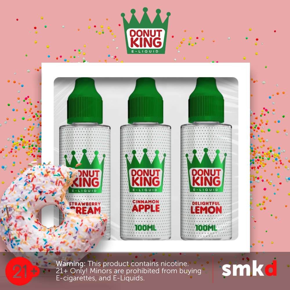
SMKD / SOCIAL CAMPAIGN
Donut King
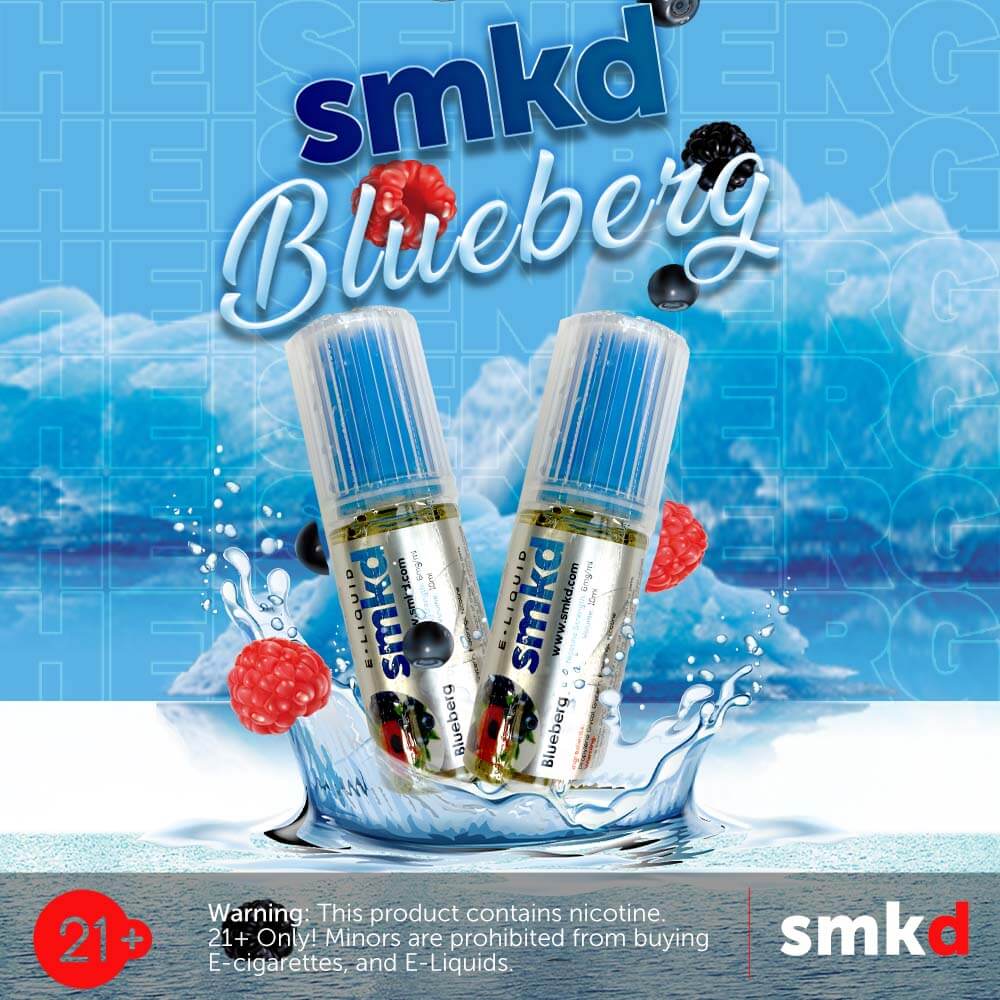
SMKD / SOCIAL CAMPAIGN
Blueberg
A commercial feed cannot look like six unrelated designers touched it. The variation is deliberate; the production rules underneath stay consistent.
03
Motion & short-form
Designed to move, not just sit on a feed.
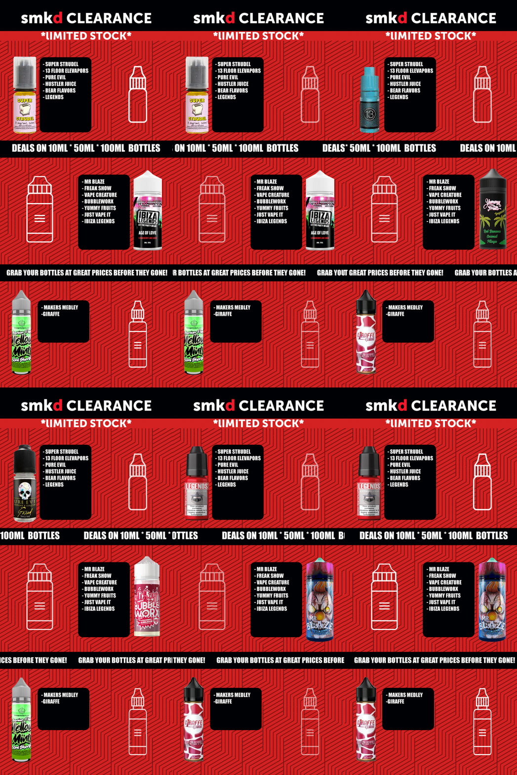
CONCEPT → STORYBOARD → ANIMATION → EDIT → EXPORT
The still frame is only
where the movement starts.
Short-form campaign work was built around clear hierarchy first: one message, one visual hook, then motion used to control attention rather than decorate the frame.
04
Beyond the feed
Print, collateral and illustration-led design still have to feel like the same designer made them.
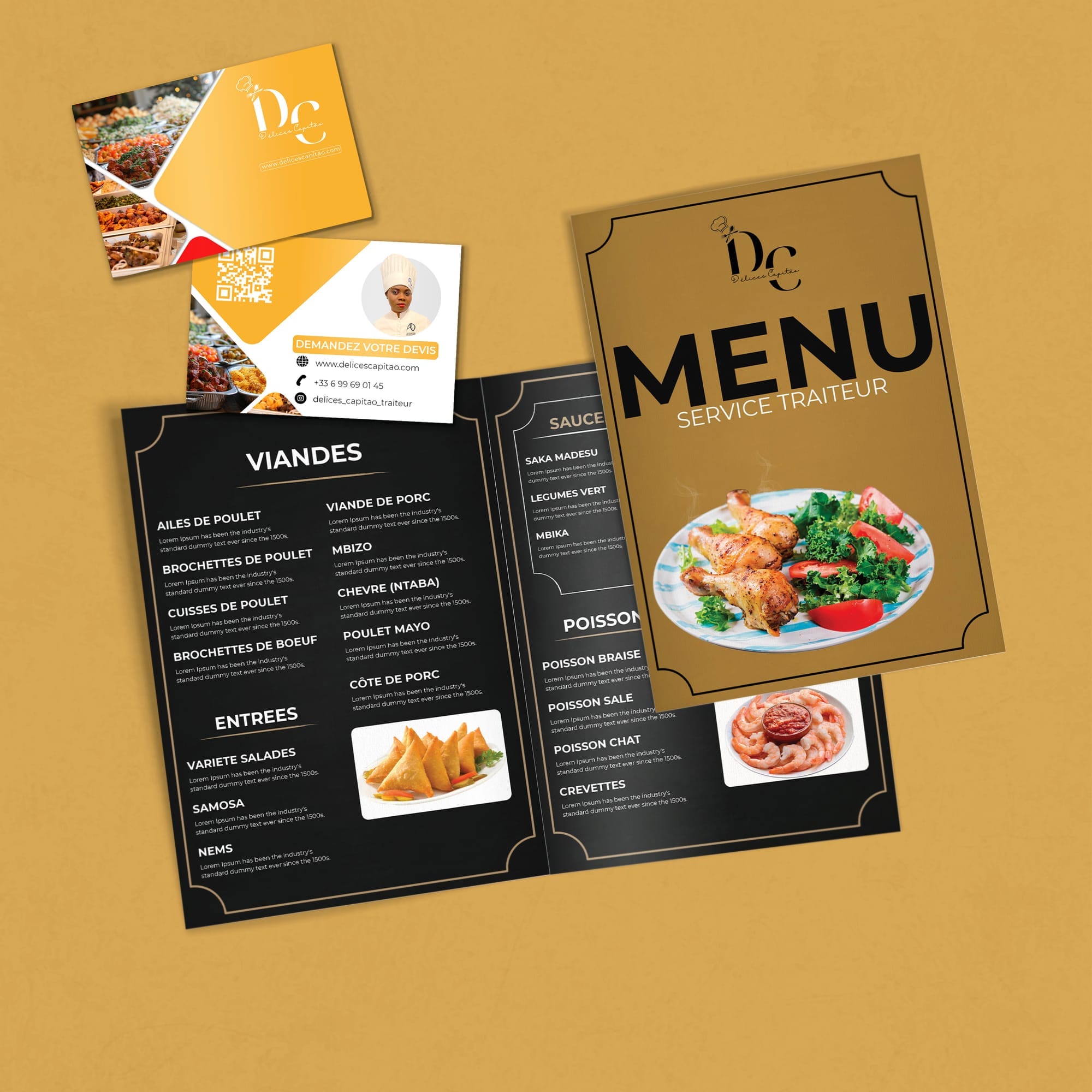
MENU SYSTEM · COLLATERAL · PRINT
Commercial design off-screen.
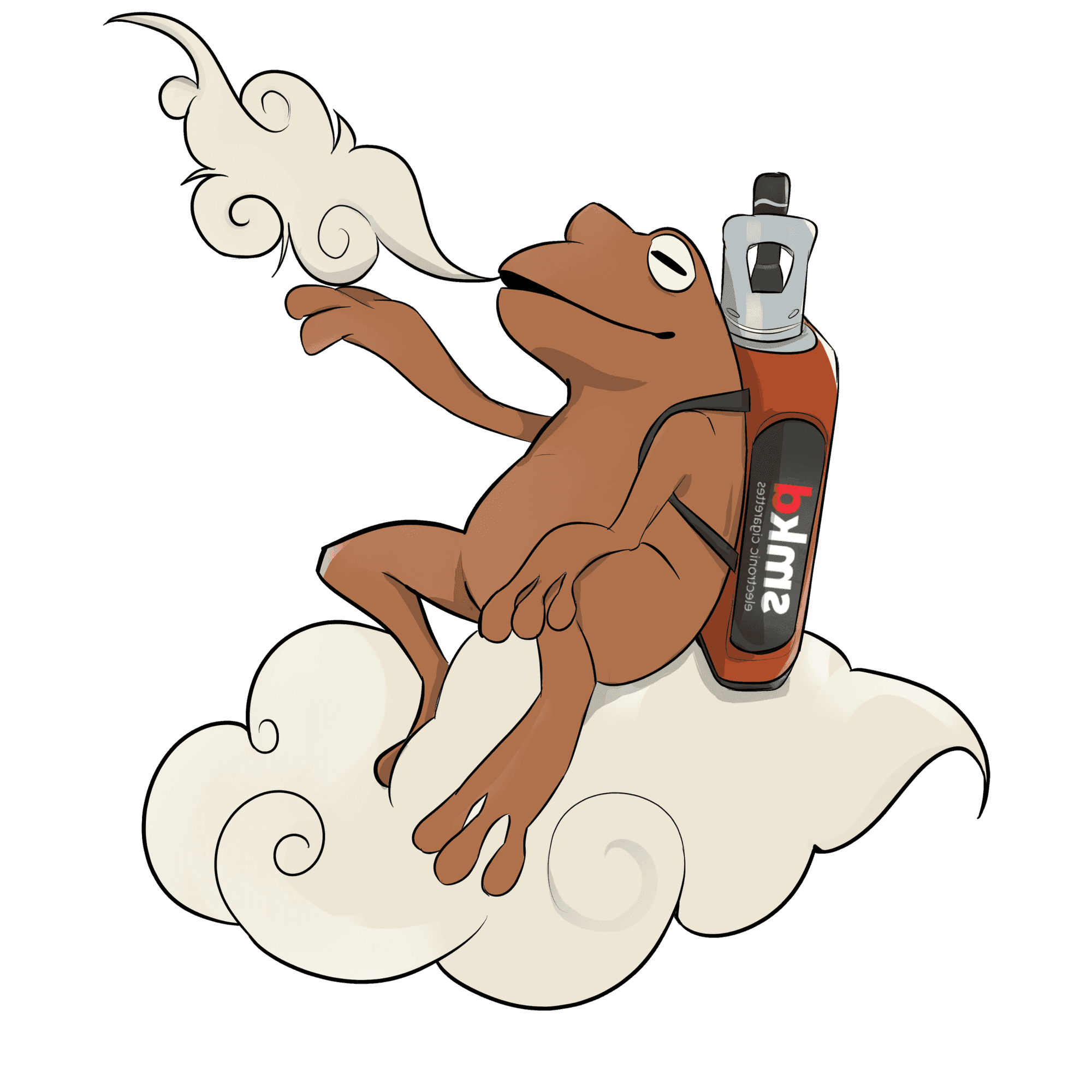
ILLUSTRATION-LED CAMPAIGN ART
Drawing becomes part of the system.
GRAPHIC DESIGN · MOTION · IMAGE-MAKING
Different formats. Same visual brain.
Brand systems, campaigns, illustration and motion — built with the same obsession for hierarchy, colour and consistency.